
The Midbloom Journal
field notes
Design ideas, real projects, and observations for independent shop owners
Field Notes
ONEOFEACH: From Pop-Up to Permanent
Tamburai had no shortage of ideas for the ONEOFEACH storefront. Our discovery work turned that wishlist into a clear brief for the shop’s next chapter.


Discovery and spatial strategy for the next chapter of ONEOFEACH
Some stores feel like their brand the moment you walk in. Others take a little longer to get there.
ONEOFEACH already had a strong, distinctive identity. Founded by Tamburai Chirume and her mother, Pauline Munemo, known as Mama P, the brand has a clear point of view rooted in craftsmanship, cultural connection, individuality, and story.
It began in 2014 with leather offcuts and fabrics Mama P had collected over the years. Many of the materials were available in such small quantities that certain combinations could only be made once. One of each. Over time, the name came to mean more than the materials themselves and grew to reflect the individuality of the designers, makers, collaborators, and customers connected to the brand.
By the time I started working with Tamburai, the opportunity was not to define the brand. It was to figure out how the physical space could express more of what was already there.
Tamburai wanted the shop to feel more intimate and intentional. She wanted people to be able to browse, sit, talk, learn about the work, attend a workshop, or spend time with an artist’s story without everything happening in one big open room.
There were plenty of ideas attached to that vision: a stronger arrival, more defined seating, a projection wall, workshops, exhibitions, better storytelling, and more thoughtful ways to give individual pieces presence.
The challenge was turning all of that into a spatial strategy.
What we discovered

The existing store had a lot going for it. It had generous square footage, a lounge, several product areas, and enough flexibility to support far more than a standard retail floor.
But the experience was not yet moving with much intention.
There was no strong focal point when someone entered. The lounge sat outside the natural shopping path. Product was distributed throughout the room, but there was not a strong hierarchy helping customers understand what to notice first or where to go next. Checkout was easy to overlook.
The brand story was also mostly living in conversation rather than in the space itself. Customers were asking about the fabrics, the makers, the beadwork, and the stories behind individual pieces, but very little of that context was available to discover without speaking directly to someone.
And as ONEOFEACH began thinking about workshops, exhibitions, screenings, artist features, and community events, the store did not yet have clear places for those things to happen.
The room was open, but it was not yet giving every part of the experience a job.
The biggest opportunities showed up quickly: the lighting felt flat, the walls had room for more storytelling, some of the displays still read as temporary, the zoning was unclear, and checkout did not have much visual presence.
None of those things meant the store was failing. They simply showed us where the physical experience could become more intentional.
We started with what was already happening
The most useful part of discovery was that Tamburai was not guessing about how people behaved in the shop.
By then, she had months of customer behavior from that specific location to draw from. She knew which products stopped people, that the beadwork near the front was getting attention, and that customers were asking questions about the fabrics and makers.
She had also seen the store begin to take on a life beyond everyday retail. The amount of space had opened up possibilities for workshops, exhibitions, screenings, artist features, and gatherings that had not necessarily been part of the original pop-up plan.
That changed how I approached the project.
I was not starting with an empty floor plan and imagining what a theoretical customer might do. We could start with what people were already doing and pay attention to where the experience felt natural, where it lost momentum, and where the space was not yet supporting the things ONEOFEACH wanted to grow into.
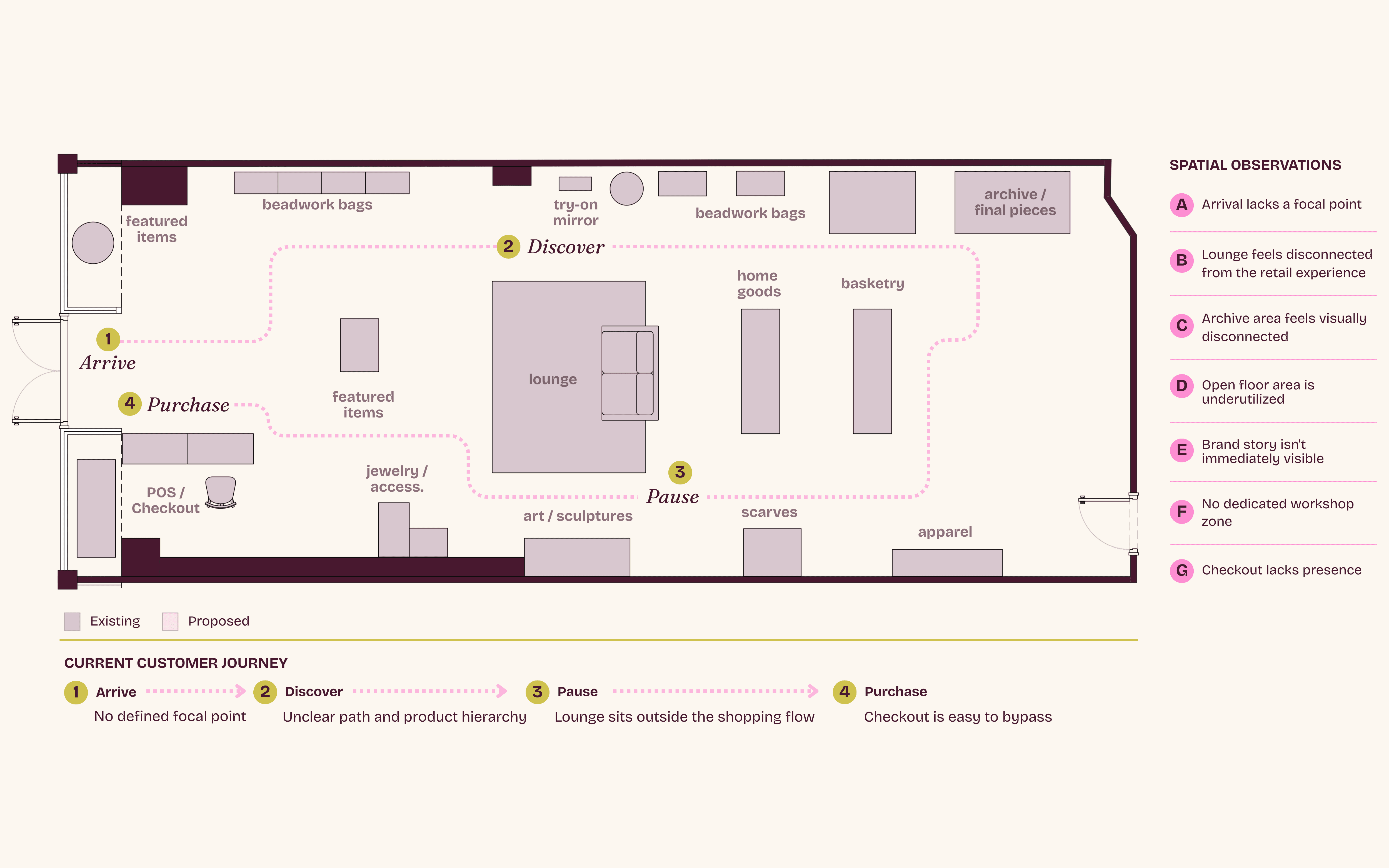
We mapped the existing journey as a series of moments: arrive, discover, pause, purchase.
That made the gaps easier to see.
At arrival, there was not a strong first moment pulling someone into the store. As customers moved deeper into the space, product was available to browse, but the path and hierarchy were loose. The lounge gave people somewhere to sit, but it was not strongly connected to the shopping experience. And at the end of the journey, checkout was easy to bypass.
The store already had many of the right ingredients. They just were not always connected.
We worked backward from the ideas
Tamburai came into discovery with a lot of ideas for what the storefront could become, but the useful part was understanding what each idea was actually trying to accomplish.
More seating, for example, sounded like a furniture request. But the real goal was to make people feel comfortable enough to stay longer.
The projection wall was not simply about adding a screen. It could support films, events, artist stories, and a more immersive way of sharing the brand. The gallery idea was not about making the shop feel formal. It was about giving individual pieces enough breathing room and context for people to understand why they were special. Workshops and exhibitions were not just extra programming to squeeze into the floor plan. They were part of making the storefront a place for creative exchange and community.
Once we understood what was behind each request, it became much easier to evaluate the design.
More seating can sound like a furniture problem. But if the real goal is helping people stay longer, you are solving a much bigger design problem.
That goal affects where people sit, what they can see from there, how lighting feels, whether the seating is connected to the shopping path, and whether someone feels comfortable lingering in the first place.
That distinction shaped the rest of the project.
What the shop needed to support
As discovery continued, it became clear that the storefront had several jobs.
It needed to work well on an ordinary retail day, but it also needed to support workshops, exhibitions, storytelling, screenings, gatherings, and future collaborations.
ONEOFEACH was planning a grand opening and an exhibition with an artist from South Africa. There were also ideas for beadwork classes and other programming connected to the African Academy of Fashion.
The brand story needed more space in the experience too. Tamburai wanted customers to encounter the materials, makers, cultural connections, and social impact without needing someone to explain everything first.
The goal was not to turn the store into a museum or cover every wall with information. It was to create enough moments throughout the shop for the story to unfold naturally as someone moved through it.
By the end of discovery, we were no longer looking at a loose list of wants. We had a much clearer sense of what the storefront needed to do.
Two ways the space could work
From that foundation, I developed two different spatial concepts. They were not simply variations of the same floor plan. Each one prioritized a different version of the ONEOFEACH experience.
Gallery Flow
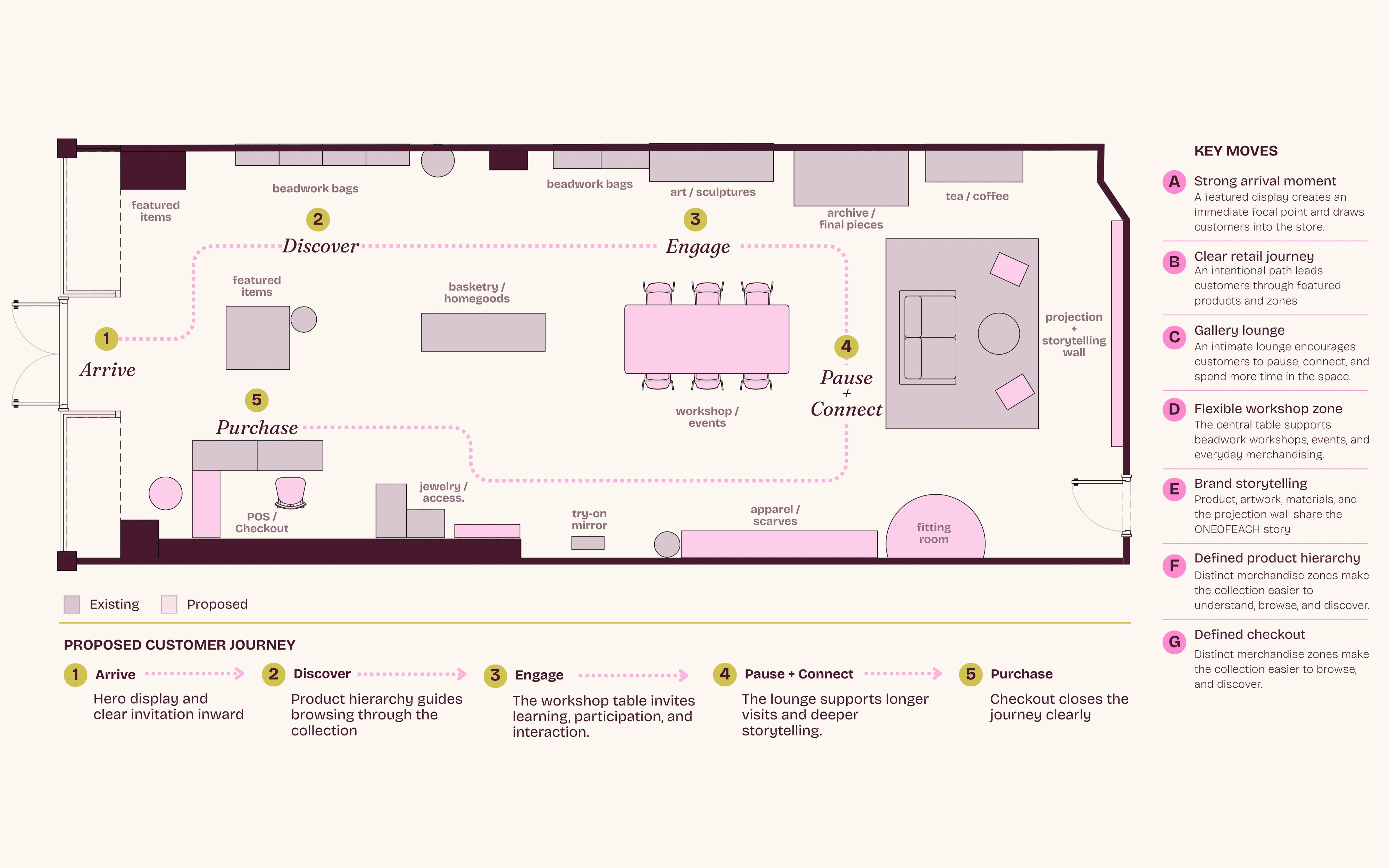
Gallery Flow treated the store as a more curated retail journey.
A stronger arrival moment introduced customers to the collection as soon as they entered. Product hierarchy became clearer, and individual pieces had more room to breathe. The lounge became a storytelling destination toward the back of the store, giving customers somewhere to slow down after browsing.
This option leaned more heavily toward everyday retail and product discovery.
Social Atelier
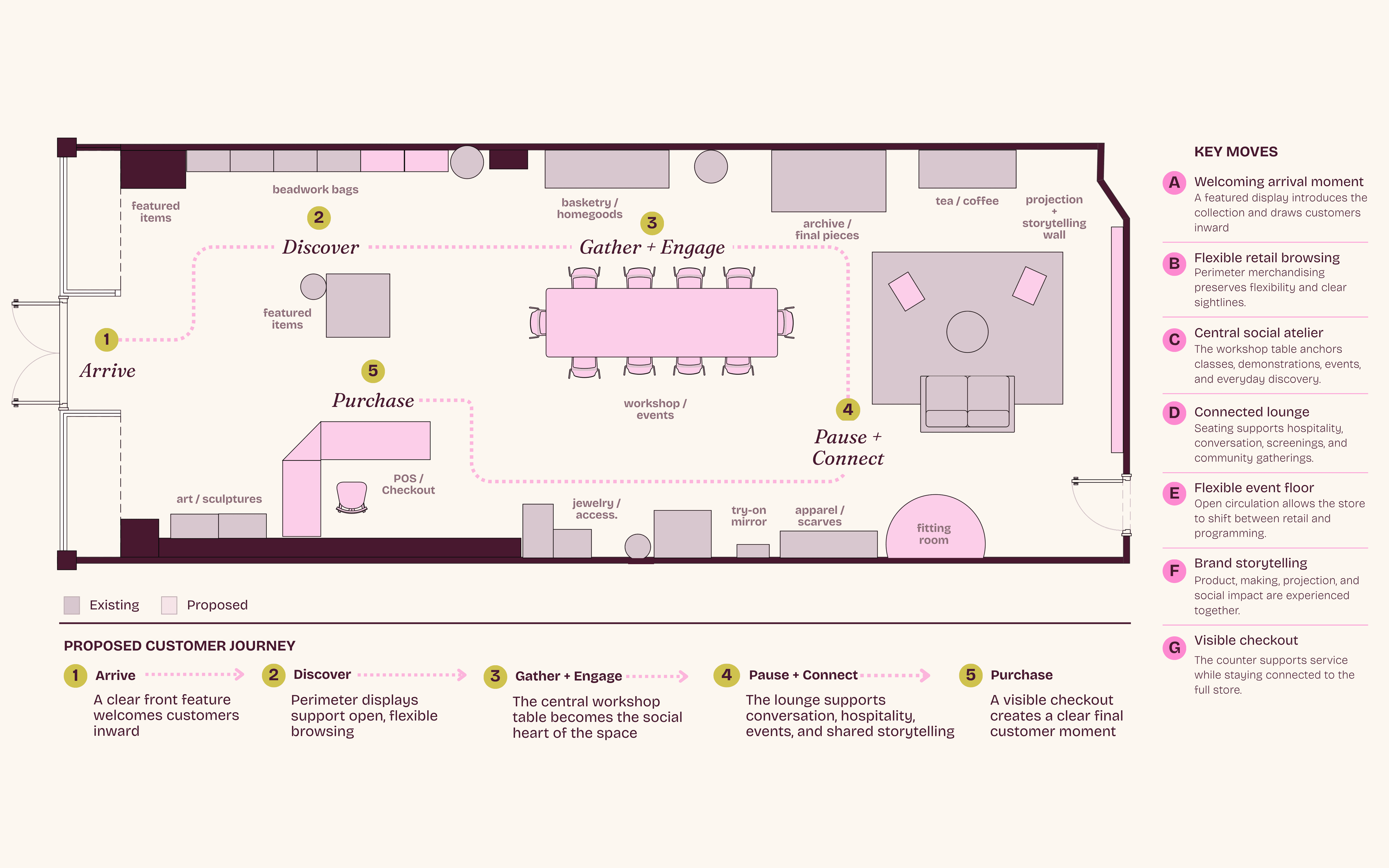
Social Atelier put gathering at the center of the shop.
A large workshop table became the social anchor of the room. On an ordinary day it could support product discovery, conversation, or informal interaction. During programming it could host beadwork classes, demonstrations, workshops, and events.
Moving more merchandise toward the perimeter opened the center of the floor and created clearer sightlines. The lounge became more connected to the customer journey, and the store could shift between retail and programming without feeling like an entirely different space every time.
This option made more room for the broader role ONEOFEACH wanted the storefront to play.
The direction
We moved forward with Social Atelier, while borrowing a few of the strongest moves from Gallery Flow.
The recommendation came down to what ONEOFEACH wanted the store to become. Everyday retail still mattered, but so did workshops, exhibitions, storytelling, hospitality, and community. A plan built around gathering gave those things a permanent place in the experience instead of treating them as occasional add-ons.
Five moves shaped the direction.
01 / Create a stronger arrival
The front of the store needed a clear first moment.
A featured display near the entrance gives customers somewhere to look immediately and creates a place for ONEOFEACH to highlight a collection, artist, collaboration, or story without asking every display in the store to carry the same visual weight.
02 / Move browsing toward the perimeter
More product moves toward the walls and edges of the shop.
That creates clearer sightlines through the room, gives merchandise a stronger sense of organization, and lets customers browse more naturally instead of navigating around scattered fixtures. It also frees up the center of the floor for interaction and programming.
03 / Make the workshop table the social anchor
The central table becomes one of the most important pieces in the plan.
During everyday retail it can support product discovery, styling, conversation, and informal interaction. During programming it becomes the home for workshops, classes, demonstrations, and events. Instead of setting up a temporary workshop zone every time something happens, gathering becomes part of the store itself.
04 / Bring the lounge into the journey
The lounge moves from feeling separate to feeling intentional.
It becomes a place where someone can pause, talk about a piece, watch a screening, learn about an artist, or simply spend more time in the store without feeling like they are sitting in the middle of the sales floor. That shift supports the intimacy Tamburai kept describing during discovery.
05 / Make checkout easier to find
Checkout moves into a more visible position near the front.
It still stays out of the way of the arrival experience, but it becomes easier to understand as the final part of the customer journey. Instead of feeling tucked away, it becomes a deliberate moment of service and connection.
With those moves in place, the customer journey became much clearer:
Arrive. Discover. Gather and engage. Pause and connect. Purchase.
That sequence is not meant to force every customer through the shop in exactly the same way. Someone might walk straight to a bag they noticed from the entrance. Someone else might stop at the workshop table, browse the perimeter, spend time in the lounge, and return to a piece they saw earlier.
Both work.
The point was to give the space enough structure that customers could move through it intuitively while still leaving room for discovery.
The brief that came out of discovery
By the end of the process, we had a clear direction for the next phase of the storefront.
ONEOFEACH needed a more intimate, gallery-like retail experience where shopping, storytelling, gathering, and learning could happen together.
That meant creating a stronger arrival, making browsing easier to read, giving products more context, building natural moments to pause, and allowing the same space to support everyday retail, workshops, exhibitions, and events.
It also gave us a much more useful set of questions for the design direction that followed.
What should someone notice first when they walk in?
How should the central table work during retail hours and during a workshop?
What would make the lounge feel intimate instead of disconnected?
Where should the ONEOFEACH story show up?
How could the archive feel intentional?
And what should checkout look like now that it had a more visible role in the experience?
Those questions became the foundation for the next phase.
From there, the project moved into visual direction, materials, fixtures, storytelling, and implementation.
[Coming Soon Part 2: From Spatial Strategy to Design Direction →]
If this sounds familiar
A lot of shop owners reach this point.
The brand is clear. The business has grown. Customers are coming in. The space technically works.
But the physical experience does not always reflect where the business is headed.
That is what a midbloom Space Audit is designed to help clarify.
I look at how your space is working now, how customers are moving through it, where the layout, displays, or storytelling may be getting in the way, and which changes are actually worth prioritizing. Then I turn that into a clear plan for what to address first, what can wait, and what your next steps should be.